On this page
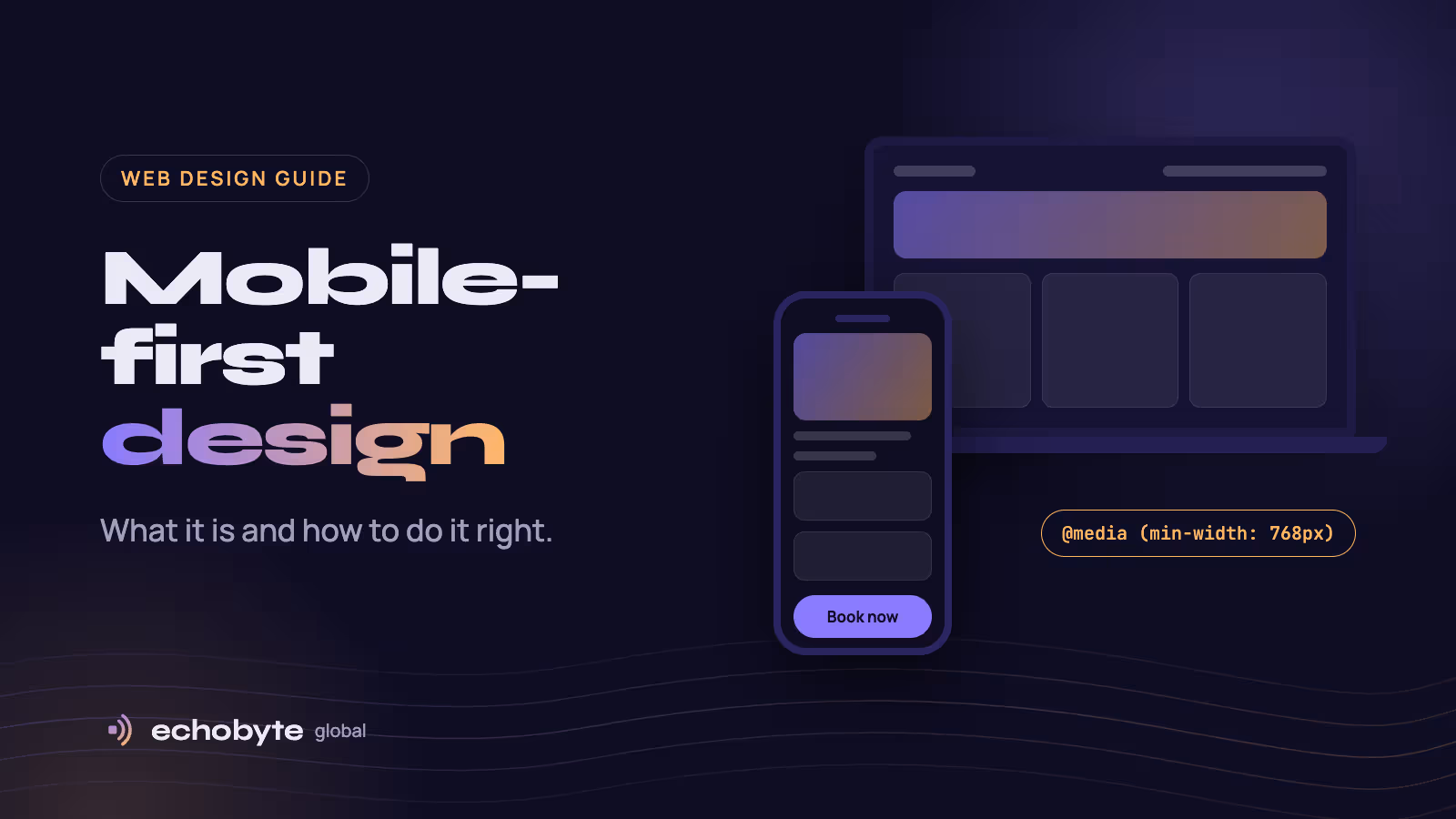
Mobile-first design means designing a website for the smallest screen first, then adding layout and features as the screen gets bigger. You start with what a person on a phone needs most, usually one clear message and one obvious action, and enhance from there. Desktop becomes the expanded version, not the starting point.
It isn’t a trend anymore. Phones carried 58.99% of worldwide web traffic in September 2026, according to StatCounter, and Google ranks your site based on its mobile version. This guide explains what mobile-first design is, how it differs from responsive design, the principles that matter most, and how to build it, with examples from sites we’ve designed.
Mobile-first vs desktop-first vs responsive design
Responsive design is the technique; mobile-first and desktop-first are the order you work in. A responsive site uses one set of pages that adapts to any screen, and Google recommends responsive design because it’s the easiest to build and maintain. The question is which screen you design for first.
| Desktop-first | Mobile-first | |
|---|---|---|
| Starting point | A wide layout, later squeezed onto phones | A phone layout, later expanded for larger screens |
| CSS breakpoints | max-width queries that remove things | min-width queries that add things |
| Content decisions | Cut down at the end, often in a hurry | Prioritised from day one |
| Speed on phones | Often loads desktop-sized assets | Lean by default |
| Typical failure | Cramped pages and hidden content on phones | A plain desktop layout if nobody enhances it |
Mobile-first forces the hard decisions early, which is why most phone-heavy audiences are better served by it.
Why mobile-first design matters in 2026
Three facts make mobile-first the safe default for almost every business site.
- Most visits come from phones. In September 2026, phones accounted for 58.99% of web traffic worldwide, desktops 39.26% and tablets 1.76%, according to StatCounter.
- Google ranks your mobile version. Google uses the mobile version of a site for indexing and ranking. If something is missing from your phone layout, Google treats it as missing from your site. Its advice is to fold extra content into accordions or tabs on mobile rather than remove it.
- Speed is measured on phones. Google’s Core Web Vitals judge how fast your main content appears (LCP, under 2.5 seconds), how quickly the page reacts to taps (INP, under 200 milliseconds) and how much the layout jumps (CLS, under 0.1). Phones on mobile networks are where most sites fail these.
There’s a business reason too: phone visitors want to act fast. A visible call button or a short form converts people who would never fill in a long desktop-style form.
7 principles of mobile-first design
These are the rules we follow on every project. Each one is cheap to get right early and expensive to fix later.
- Decide what matters most. Pick the one thing a phone visitor came for, such as a price, a booking or a phone number, and put it on the first screen. Rank everything else below it.
- Design for thumbs. Put key buttons where a thumb reaches easily, in the lower and middle part of the screen. Make tap targets big: WCAG 2.2 sets a 24×24 pixel minimum, and Apple and Google design guidelines recommend about 44 to 48 pixels.
- Give each screen one main action. “Call now”, “Book a visit” or “Add to cart” should stand out from everything else. On long pages, a sticky button keeps it in reach.
- Make text readable without zooming. Use at least 16px for body text and form fields. Below 16px, iPhones zoom in when someone taps a form field, which breaks the layout.
- Make forms painless. Ask only for what you need, and use the right field types (
email,tel) andautocompleteattributes so phones show the right keyboard and fill in details automatically. - Budget for speed. Serve images in modern formats such as AVIF or WebP at the size the screen needs, lazy-load images below the fold, and question every third-party script.
- Enhance for larger screens, never hide. Add columns, images and extra detail as space grows, but keep the same content and headings on every screen. Use accordions on mobile instead of removing sections, because Google indexes what phones see.
How to build a mobile-first website
In code, mobile-first means your base styles are for phones, and min-width media queries add layout as screens get wider. Start with the viewport tag, without which phones render your page as a shrunken desktop:
<meta name="viewport" content="width=device-width, initial-scale=1">Then write the phone layout first and build up:
/* Phones: one column */
.services {
  display: grid;
  gap: 1rem;
}

/* Tablets and wider: two columns */
@media (min-width: 768px) {
  .services {
    grid-template-columns: repeat(2, 1fr);
  }
}

/* Desktops and wider: three columns */
@media (min-width: 1024px) {
  .services {
    grid-template-columns: repeat(3, 1fr);
  }
}
If you use Tailwind CSS, you’re already working mobile-first. Unprefixed classes apply to every screen, and prefixes like md: and lg: only kick in from that width upward. The same layout is one line:
<div class="grid gap-4 md:grid-cols-2 lg:grid-cols-3">…</div>Test on real phones as you go, not only in your browser’s device mode, and run PageSpeed Insights on the mobile setting before launch.
Mobile-first design examples from our projects
The principles look different for every business. Here is how they played out on three sites we’ve built.
An AC repair and service company. Most customers search with a broken AC and a phone in hand. So the phone number and a “Book a service” button sit in the header on every page, the first screen offers “Call us now” as a tap-to-dial link, and every service card shows how long the job usually takes, with its own booking button.
A luxury kidswear store. Shoppers usually buy for an event, so the menu lets them shop by occasion, from Haldi and Mehendi to weddings and Eid, instead of digging through categories. Sizing questions go straight to WhatsApp, which suits how this audience already shops on their phones.
Our own site. Hover effects that only make sense with a mouse switch off on touch screens, and the service descriptions that appear on hover on desktop are simply shown on phones. Our showcase of projects scrolls sideways on desktop but becomes a swipeable row on phones, and our contact form uses phone-friendly field types so the right keyboard appears.
You can see both client projects on our work page.
Mobile-first design checklist
Run through these ten checks before any launch:
- The page includes the viewport meta tag.
- The main message and main action appear on the first phone screen.
- Buttons and links are at least 24px tall, ideally 44 to 48px.
- Body text and form fields are at least 16px.
- Nothing scrolls sideways on a 360px-wide screen.
- Phones get the same content, headings and structured data as desktops.
- Forms use the right field types and
autocomplete. - Images are AVIF or WebP and sized for each screen.
- Core Web Vitals pass on the mobile setting in PageSpeed Insights.
- You’ve tested on a real iPhone and a real Android phone.
Mobile-first design FAQ
Is mobile-first design the same as responsive design?
No. Responsive design is the technique that lets one site adapt to every screen. Mobile-first is the order you design in: phone first, then larger screens. Most good responsive sites today are built mobile-first.
Does mobile-first design help SEO?
Yes, indirectly. Google indexes and ranks the mobile version of your pages, so a strong phone layout with complete content, clear headings and fast loading supports your rankings.
What screen size should I design for first?
Start around 360px wide, a common small-phone width, and check that nothing breaks down to 320px. Then add breakpoints where your content needs them, not for specific devices.
Does mobile-first make the desktop site worse?
Not if you enhance it properly. Desktop gets the same content with more room: extra columns, larger images and richer layouts.
How do I check whether my site is mobile-friendly?
Run PageSpeed Insights on the mobile setting, open your pages in Chrome’s device mode, and use the URL Inspection tool in Google Search Console to see your page the way Google’s smartphone crawler does. Then try the key tasks, like calling or buying, on a real phone.
Is mobile-first design more expensive?
Usually not. Planning for phones from the start costs less than squeezing a finished desktop design onto small screens later.
Want a website that works beautifully on phones? We design and build fast, mobile-first websites, and every project starts with a free discovery call.